Timing vs. RescueTime: Comparing Features & Capabilities
With so many time-tracking apps available, it can be difficult to know where to begin. Which apps are user-friendly and convenient? Which apps are worth the cost? And how do you choose the app that will perform the best?
Before making a decision about a time-tracking app, you’ll want to ask yourself what you’re specifically looking for out of time-tracking. Share on X It might be the case that you’re looking for a more general overview of your time in order to reach time-usage goals. Or, you might be seeking a more in-depth time management system that helps you effectively juggle multiple clients and projects. Or maybe, you’d like something that offers a little bit of both.
In any case, you’ll want to weigh your options carefully. This week, we’re taking a deep dive into two popular time-tracking apps – RescueTime and our very own Timing – to compare features and capabilities…and help you decide what will be best for you.
What Both Apps Offer
One powerful advantage offered by both Timing and RescueTime is that they are both user-friendly, convenient, and automatic. You don’t have to log in to either app to ensure that it’s automatically tracking your working hours and minutes – both systems automatically track all your activity on your computer so that you get an accurate breakdown of your timing usage.
Here are additional features and capabilities that both Timing and RescueTime have in common:
Log total hours and minutes worked.
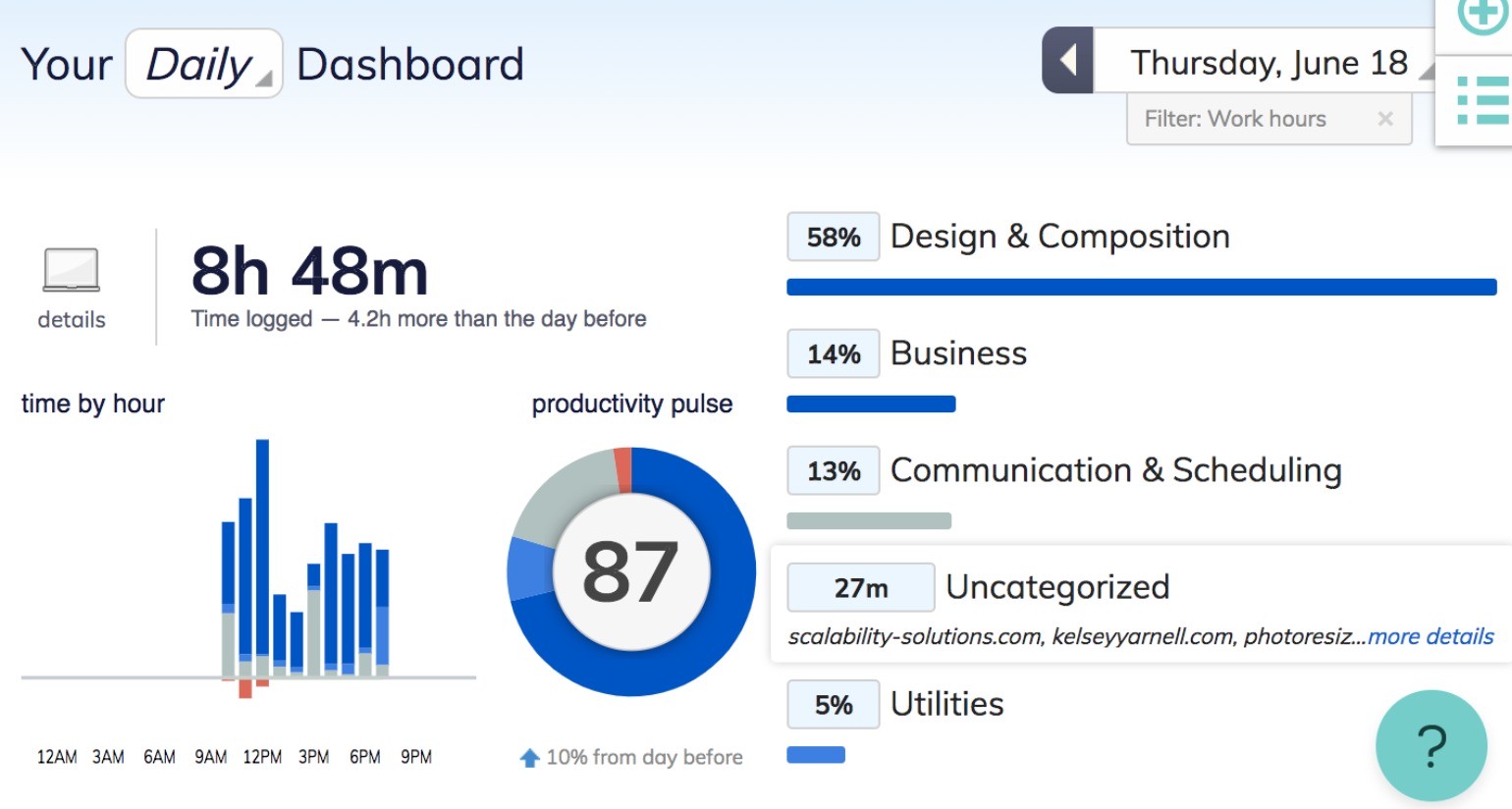
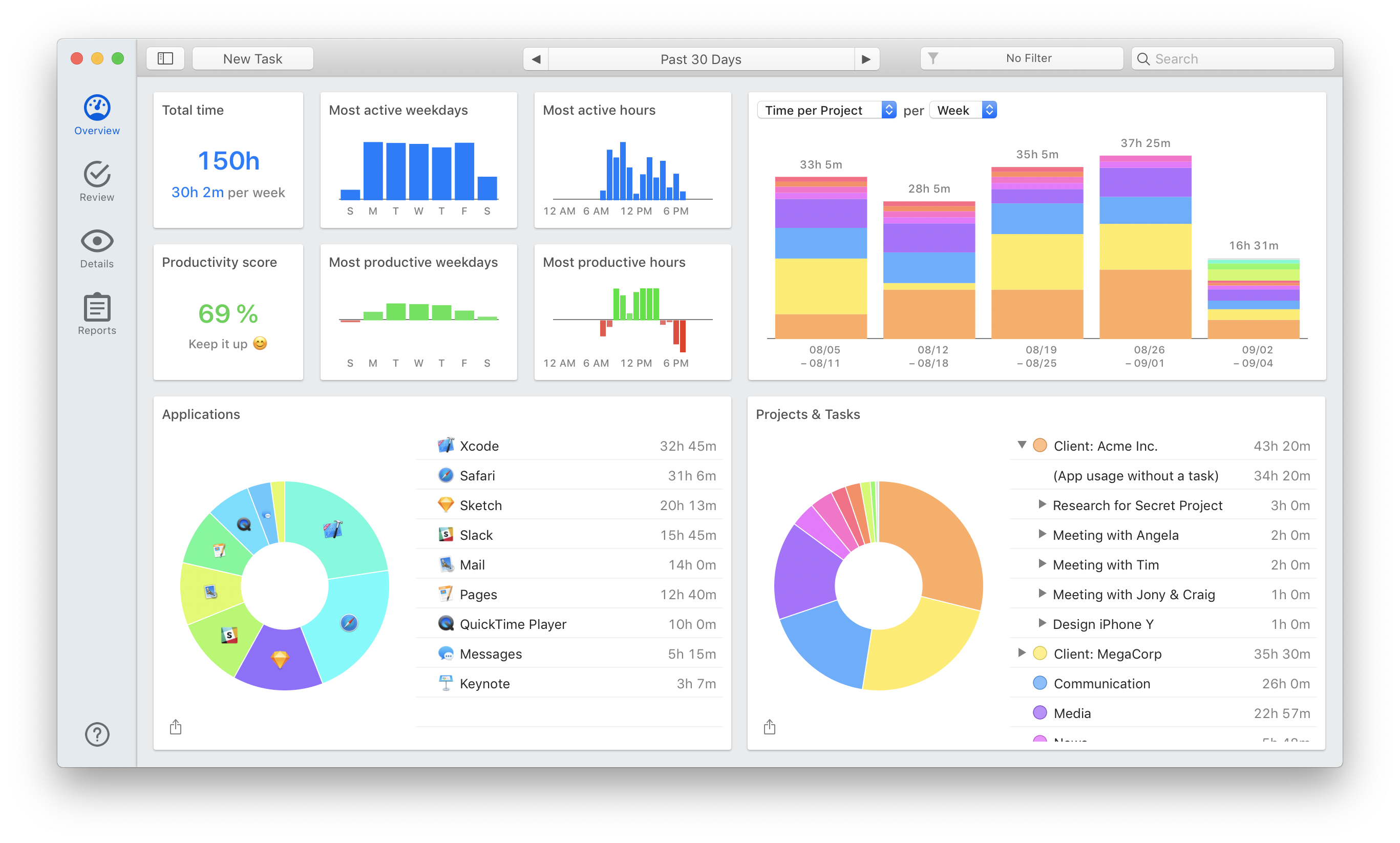
As mentioned above, both apps automatically log your total hours and minutes, which are then displayed on your “Dashboard” (RescueTime), or “Overview” (Timing). You can check this total throughout the day to see how much you’ve worked, or at the end of each day. In any case, your total time is continually updated so that you get an accurate summation.
On both Timing and RescueTime, it’s also possible to adjust the timeframe of your time usage, so that you can view how much time you’ve worked per week, per month, or even per year.
Show you what you’ve worked on.
Both Timing and RescueTime show you what you’ve worked on by URL or application. On RescueTime, this information is accessible by clicking on “more details” under specific categories displayed in the Dashboard. On Timing, this information is immediately available in the Overview tab – with even more details displayed under the Review tab.
Here is RescueTime’s Dashboard….

And here is Timing’s Overview tab…

Exporting abilities.
One of the most powerful ways to leverage your time-tracking results is to export your results as a report. Both Timing and RescueTime offer this functionality, although Timing offers more customizable options for reporting (ideal for invoicing clients).
Displays your most active hours.
Ideally, time-tracking should give you insight into when you’re working the most, in addition to how much you’re accomplishing. Fortunately, both apps offer this functionality by displaying your most active hours in an easy-to-understand bar graph.
What’s Different: Timing vs. RescueTime
Timing and RescueTime do have some commonalities, but there are critical differences between the apps. Let’s take a look at a few key areas of difference:
Categorization.
The primary area of difference between Timing and RescueTime is in the area of time categorization. Both applications rely on fairly broad categories to break down your time usage, and also provide a percentage of how much time you spend on any given category (such as RescueTime’s “Design & Composition” or Timing’s “Web Browsing”).
Timing, however, takes it to the next level by allowing you to create your own “Projects” that act as far more specific categories. Projects include customizable details (which we’ll discuss more in a minute) that allow you to “help” Timing effectively categorize your time. The result? At the end of each day, you’ll be able to see far more detail – for example, you spent 55% of your time on Client X, or 30% of your time on a particular video project.
Visualization.
Both Timing and Rescue Time offer multiple, helpful visualizations of your time usage. Both apps display your time usage as a pie chart broken down by category, and produce bar graphs that show your most active hours. The result is that you get quick, immediate insight into your time usage (especially useful for more visual thinkers).
Timing, however, offers a greater number of visualizations, with richer detail. While RescueTime offers one pie chart visualization on the Dashboard, Timing generates two pie charts that break time down by both application and project/task. Timing also offers bar graph visualizations of your most active hours and your most productive hours.
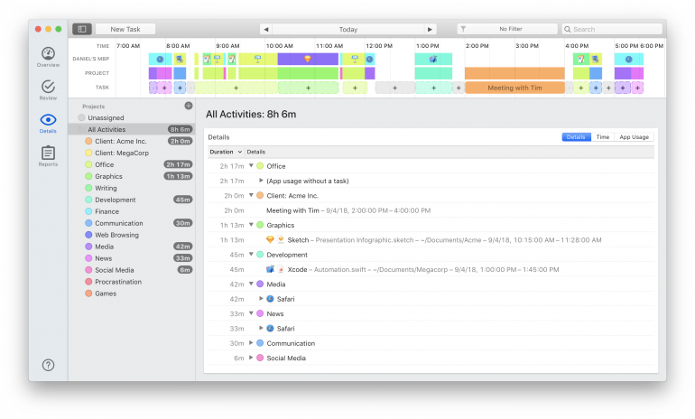
Finally, Timing generates a detailed, interactive timeline of each day’s activity, shown on the Review tab below. You can use this timeline to add New Tasks, or recategorize time after the fact – helping you to finetune your time-tracking results even more.

Keyword functionality.
Both Timing and RescueTime offer keyword functionality, but in very different ways.
RescueTime offers you the ability to search through your work by keyword – and then produces a total percentage of time spent on work related to that keyword. So, if you’re working on a project that involves the phrase “cyber security,” you can search for that keyword to discover that you, for example, spent 40% of your day on this kind of work.
Timing, on the other hand, uses keywords a bit more strategically. Remember the “Project” categories mentioned above? For every Project, you can assign keywords that help Timing to effectively categorize that time usage from the get-go. Or, you can retroactively ⌥-drag and drop detected keywords from the Review screen onto projects. At the end of the day, you have the same result as you would have received from RescueTime – but this time, the keyword is attached to a client or project title.
Productivity score.
Both applications generate a productivity score that can be extremely helpful for those looking for deeper insight into how well they’re using their time – not just how much. RescueTime produces this score based on detected activity – assuming, for example, that time spent on social networking sites is unproductive.
Timing, however, allows you to assign your own productivity ratings to Projects, so that the score produced is based on what you determine to be productive. You can adjust your productivity score when creating a new project.
The Final Verdict
Both Timing and RescueTime offer valuable time-tracking capabilities, useful insight into your personal time usage, and the ability to export reports.
That being said, Timing is far more customizable than RescueTime as it allows users to produce more detailed, fine-tuned results. Timing, for example, may be more useful for the solopreneur or freelancer looking for a tool to help them effectively manage their clients and projects.
But the only real way to know which option is best is to try yourself. For a free trial of Timing, click here. For a free trial of RescueTime, click here. Good luck!