Introducing Timing 2021.6: All-New Activities Screen and Plenty of Usability Improvements

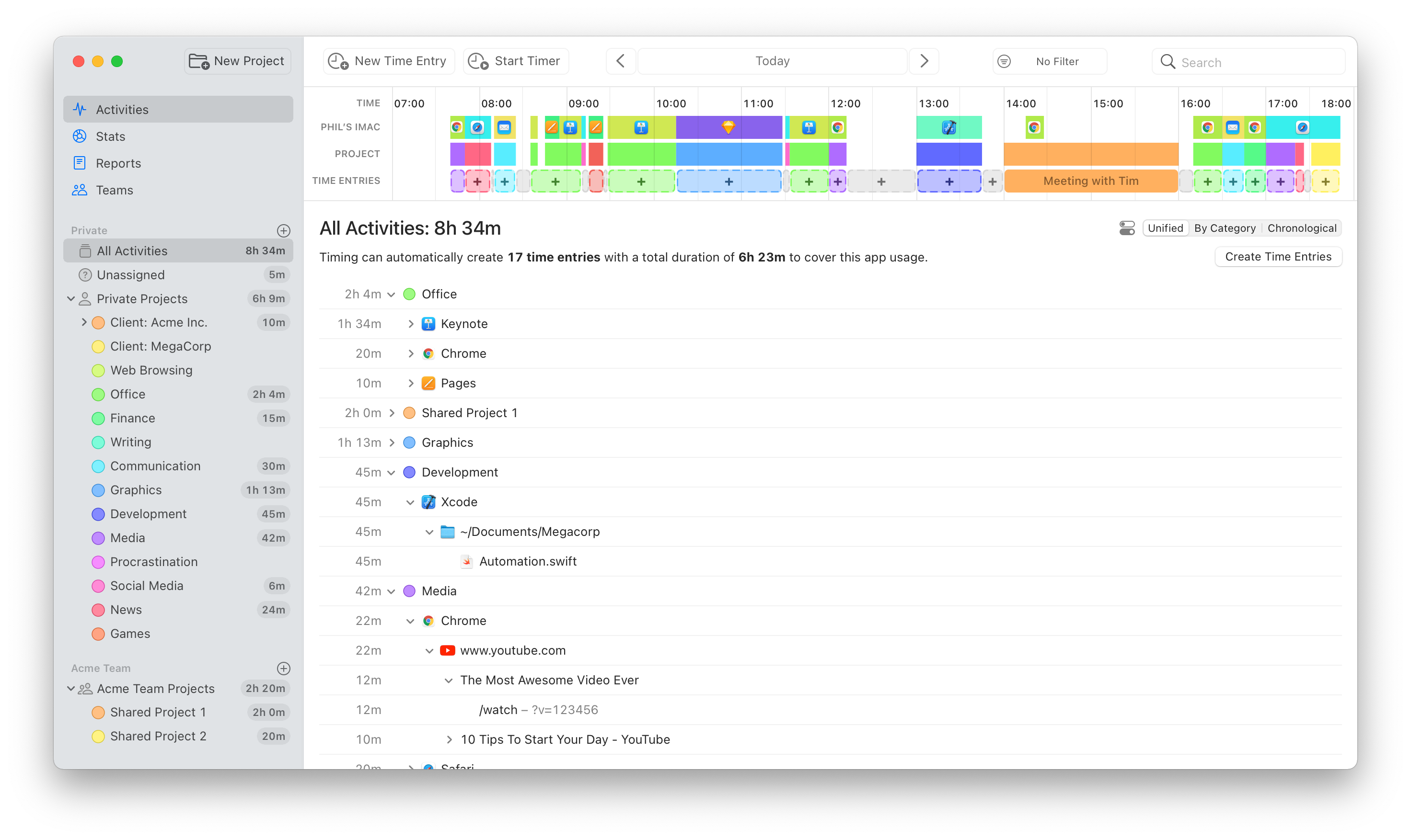
We have just released Timing 2021.6, which replaces the “Review” and “Details” screens with one unified “Activities” screen. We believe that this screen combines the best of both worlds, but we would love to hear your thoughts on it, too.
If you preferred the old “Review” screen, don’t worry; the contents of the “Review” screen are still available by selecting the “By Category” mode on the new “Activities” screen:

In addition, you can customize the appearance of the Activities screen by clicking the button next to the mode picker:

But that’s not all! The new version also introduces a ton of usability improvements that should streamline your time-tracking workflow even more:
- You can now start and stop timers right from the toolbar of the main Timing app.
- You can now also start timers via the right click context menu of a project.
- On macOS Big Sur, toolbar buttons now show labels next to their icons to make their purpose more clear.
- We have completely reworked the app’s onboarding. If you would like to give the new onboarding a try, you can access it via the “Replay Introduction” item in the “Help” menu. Maybe you’ll learn a trick or two that you didn’t know about yet!
- Timing will now warn when creating a time entry causes other entries to get overwritten.
- Slightly increased the width of time entry editors, giving you more space to enter details.
- When starting a new timer, Timing will now suggest the most recently used project by default.
- By default, Timing will stop any running timers when your Mac goes to sleep or when you quit the Timing tracker app. You can now customize this behavior in the app’s “Tracking” preferences.
And that’s just an excerpt of the full release notes.
Conclusion
That’s it for today! Feel free to let us know what you think of this bulletin, and take care!