What we learned evolving an App through 20 (!) Alphas and 10 Betas
One month ago (on May 9th, 2017), Timing 2 was released. Time for some navel-gazing! More seriously, development started in April 2016 and the app’s interface changed quite a bit over the course of those 13 months: 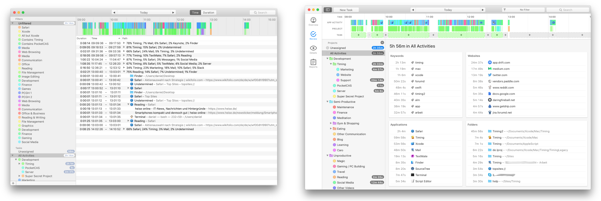 This article illustrates how an app’s UI evolves during development, and highlights some subtle but important changes. If you aren’t interested in the evolution of the app, scroll to the end of the article for a side-by-side comparison and a summary of some little changes that had a big impact!
Alpha 1 (July 5th, 2016)
 Timing 2’s initial concept revolved around “smartly” recognizing blocks of uninterrupted time and displaying them as separate groups. While the first alpha already recognized the blocks correctly (as illustrated by the timeline), the activity list was way too noisy to be even remotely useful. Also, note how rough the interface looks — but that’s expected for an app in the prototype stage ? The alpha also included a mode that grouped by application and file instead of by time — somewhat more useful, but it wasn’t even the default:
 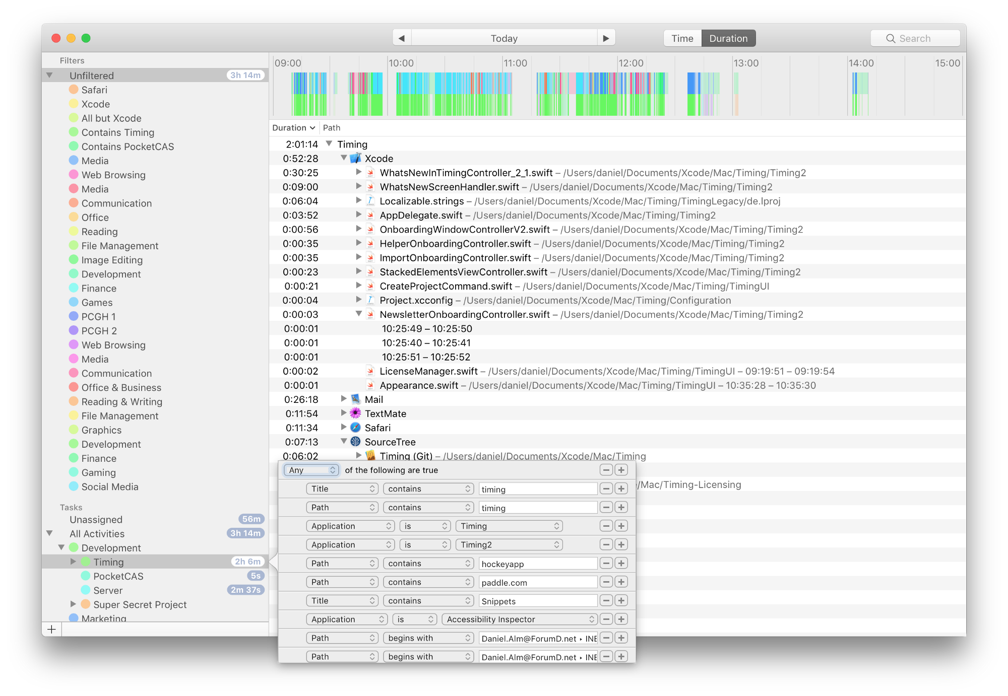 As you can see, even Timing’s rule editor is already present, but still very simple.
Alpha 5 (August 24th, 2016)
 This version already had cards that group activities by different criteria (see here for an explanation). This turned out to be much more useful in than the grouping by time or by duration. Also note the AutoGroup button in the toolbar. That feature would try to detect blocks of time, letting users quickly create tasks for these blocks. While the idea is very useful (and still present in the final version), having to go through these blocks one-by-one was cumbersome. Plus, the button in the toolbar didn’t make for a very discoverable feature.
Alpha 7 (October 19th, 2016)
The AutoGroup button was scrapped and replaced with permanent suggestions in the timeline: 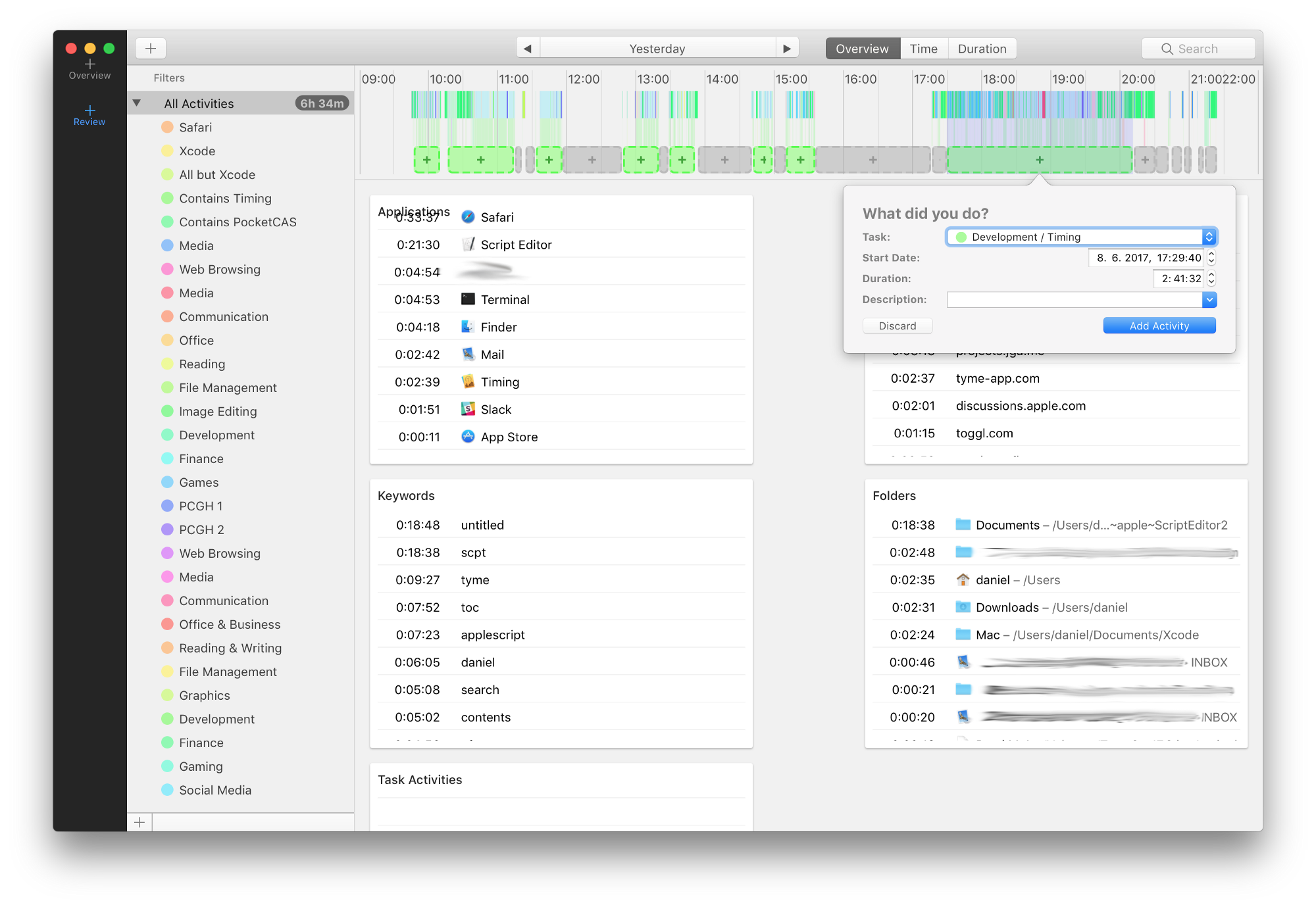 These are more accessible and easier to use, as one can pick and choose individual suggestions to use rather than having to go through all blocks one-by-one. Notice the new tab bar that leads to the ugliest dashboard ever:
 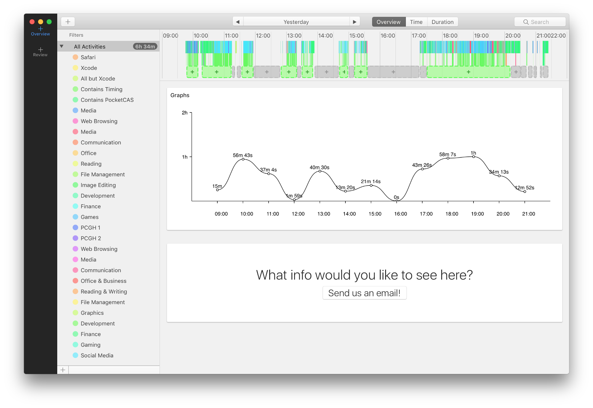 Alpha 7 also marked the introduction of a (still very bland) onboarding tutorial:
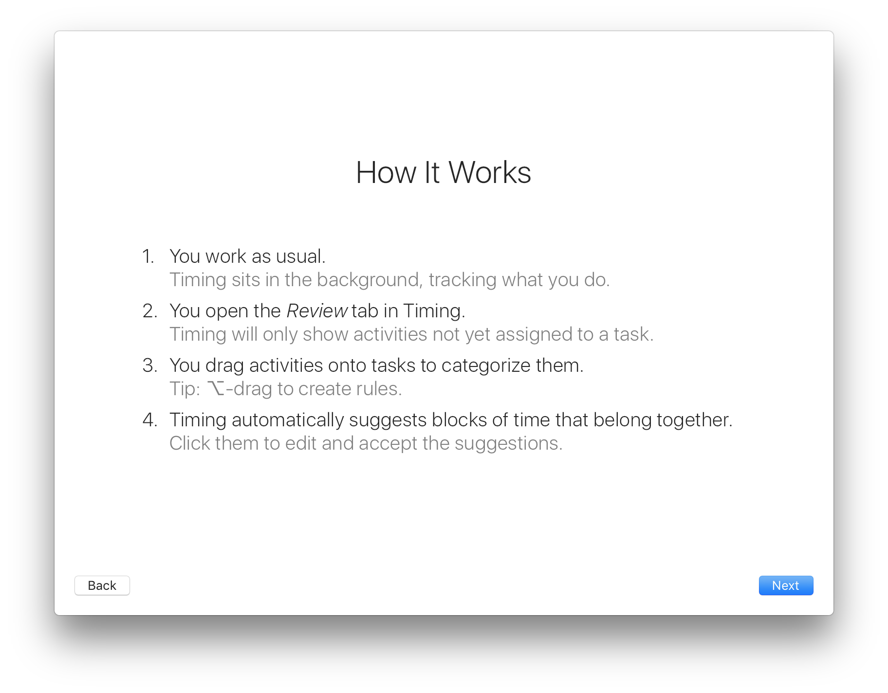
Alpha 10 (November 7th, 2016)
Replaced the ugly dashboard with a different — but still ugly — one: 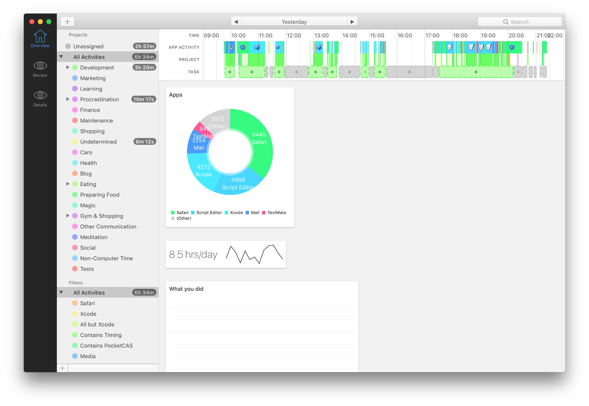 Around this time we hired Eduardo Santos to help design the app. You can already notice the first effects of his work in the much-improved timeline ?
Alpha 13 (November 17th, 2016)
 Eduardo’s work is becoming much more noticeable, for example in the improved tab bar and task editor.
Alpha 17 (December 6, 2016)
 We have a proper dashboard! Still ugly, but getting there.
Alpha 19 (December 16, 2016)
 Much better! This dashboard is actually surprisingly close to the final version. It even featured a responsive layout:
  The Review screen has made some progress as well:
 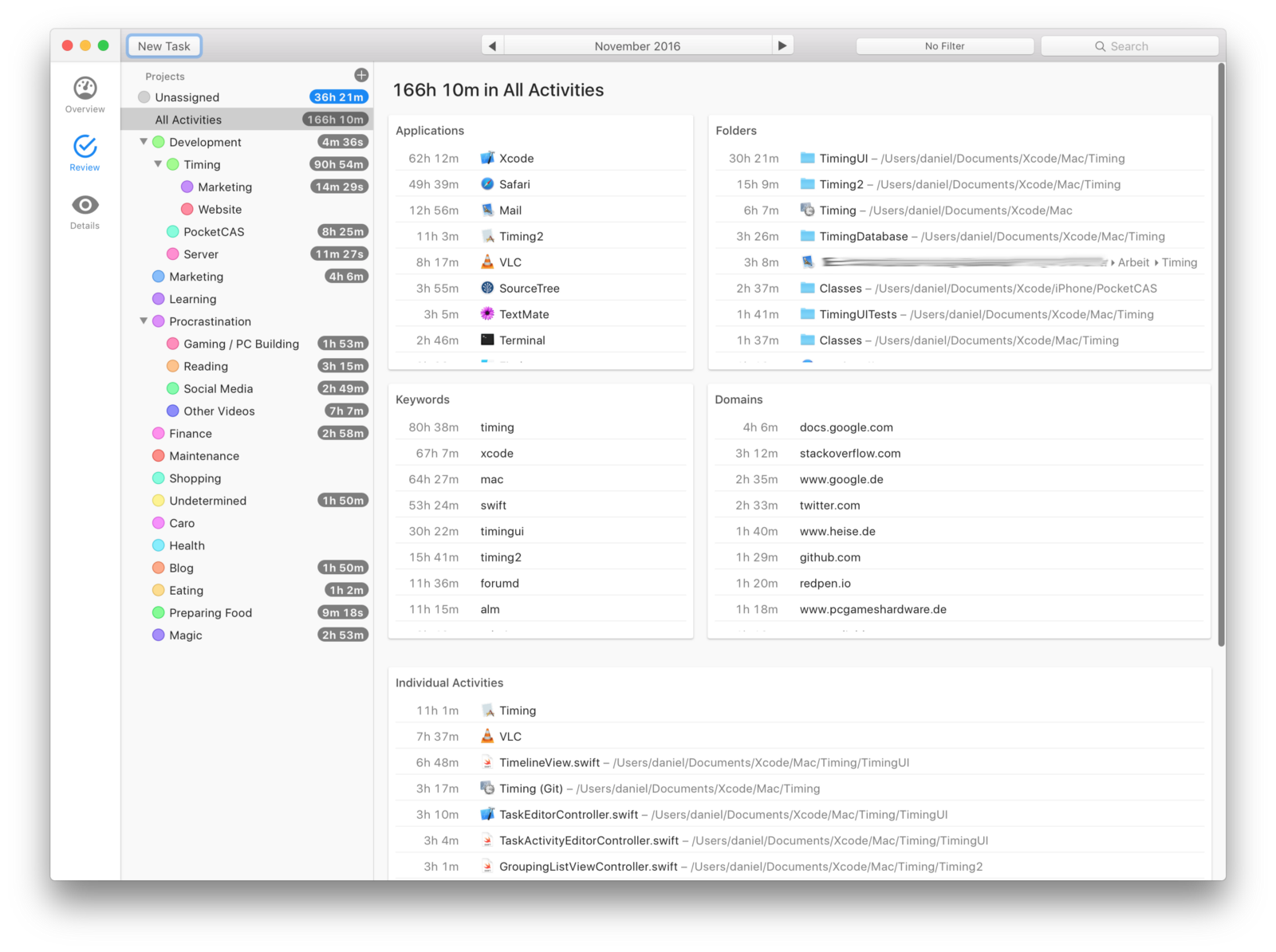 Notice how there are scrollable lists inside a scrollable container. That turned out to be a terrible idea — it makes scrolling incredibly frustrating. (I take full responsibility for that…) It was finally time for the…
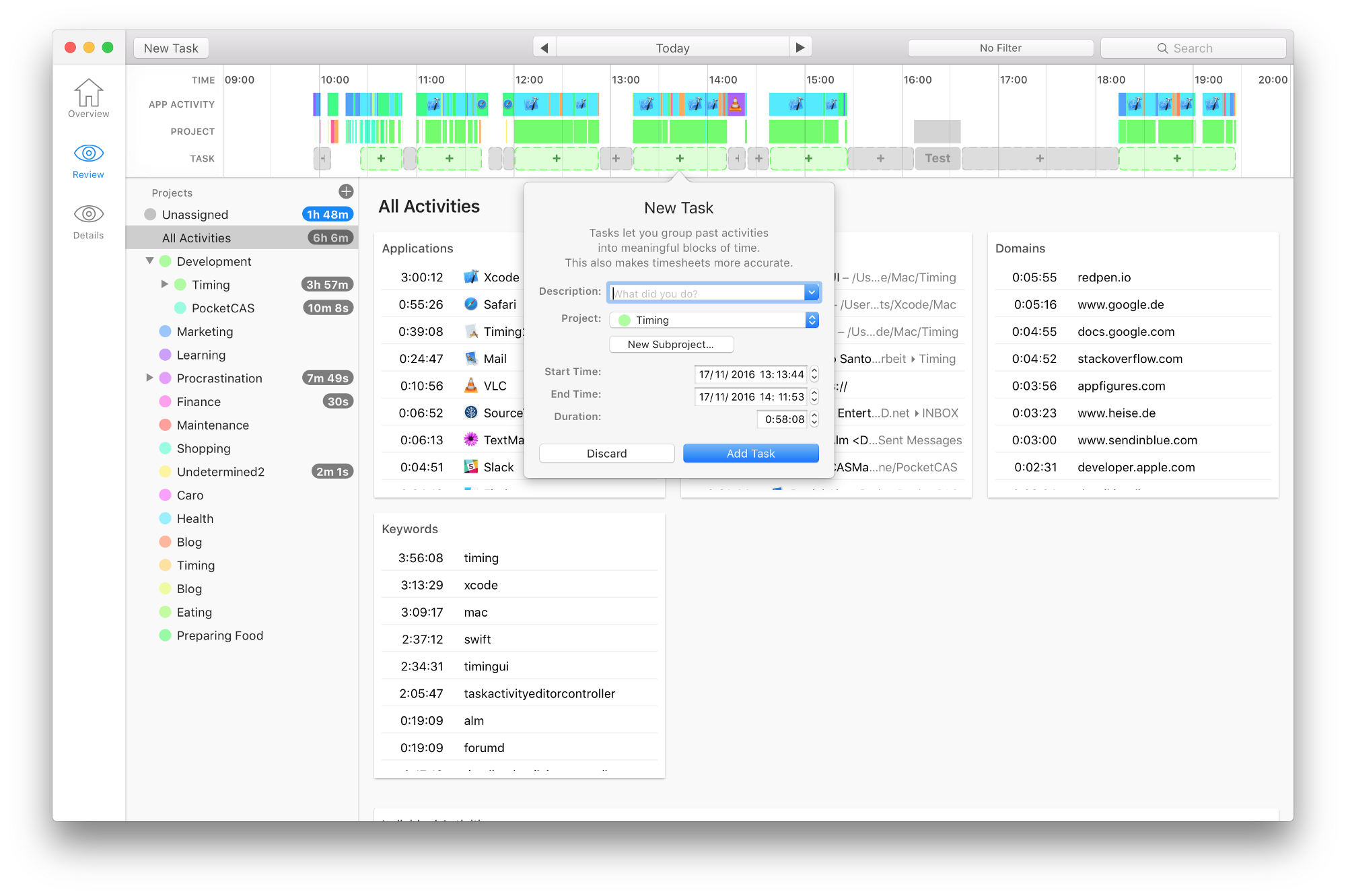
Beta 1 (Jan 12, 2017)
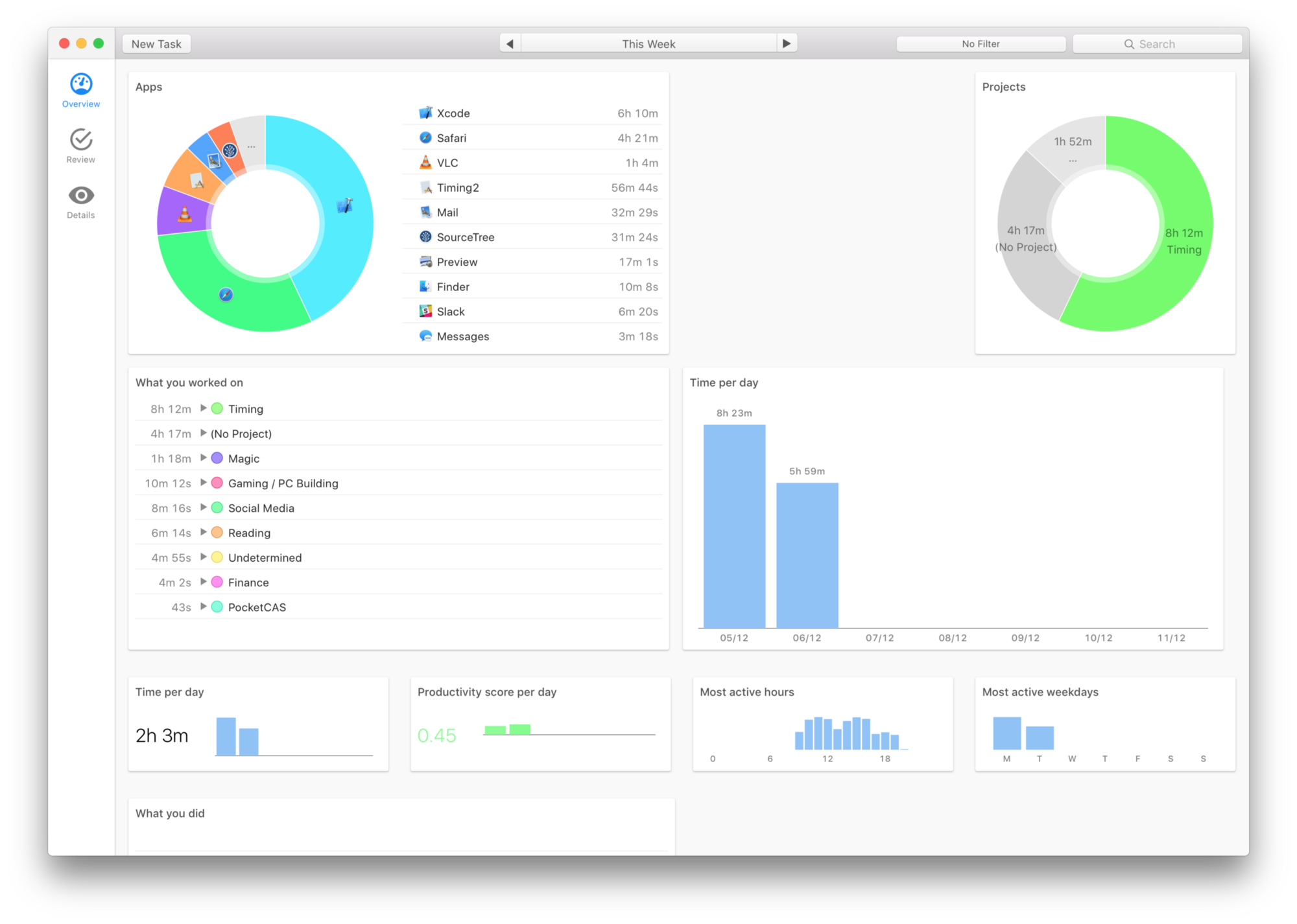
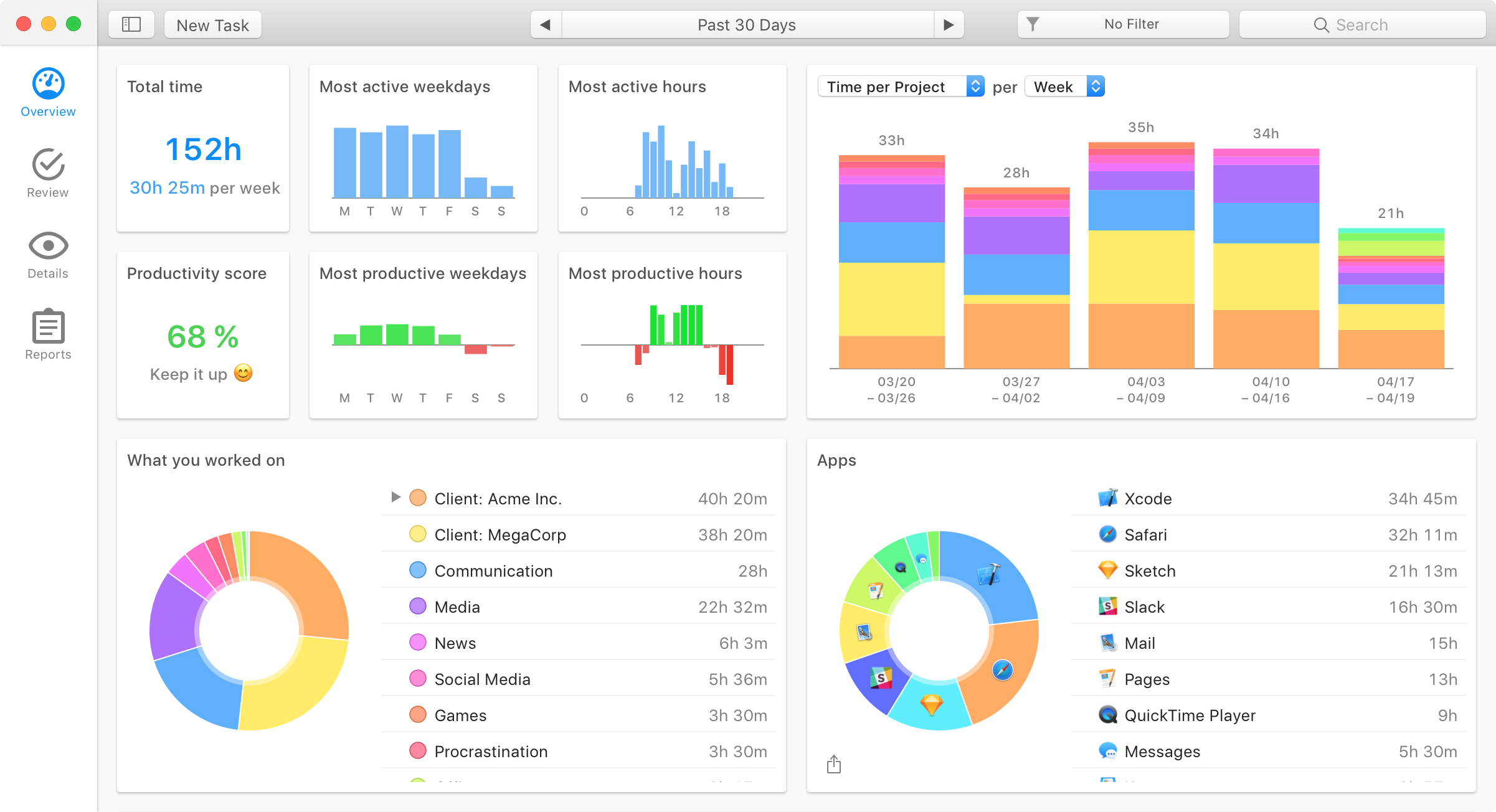
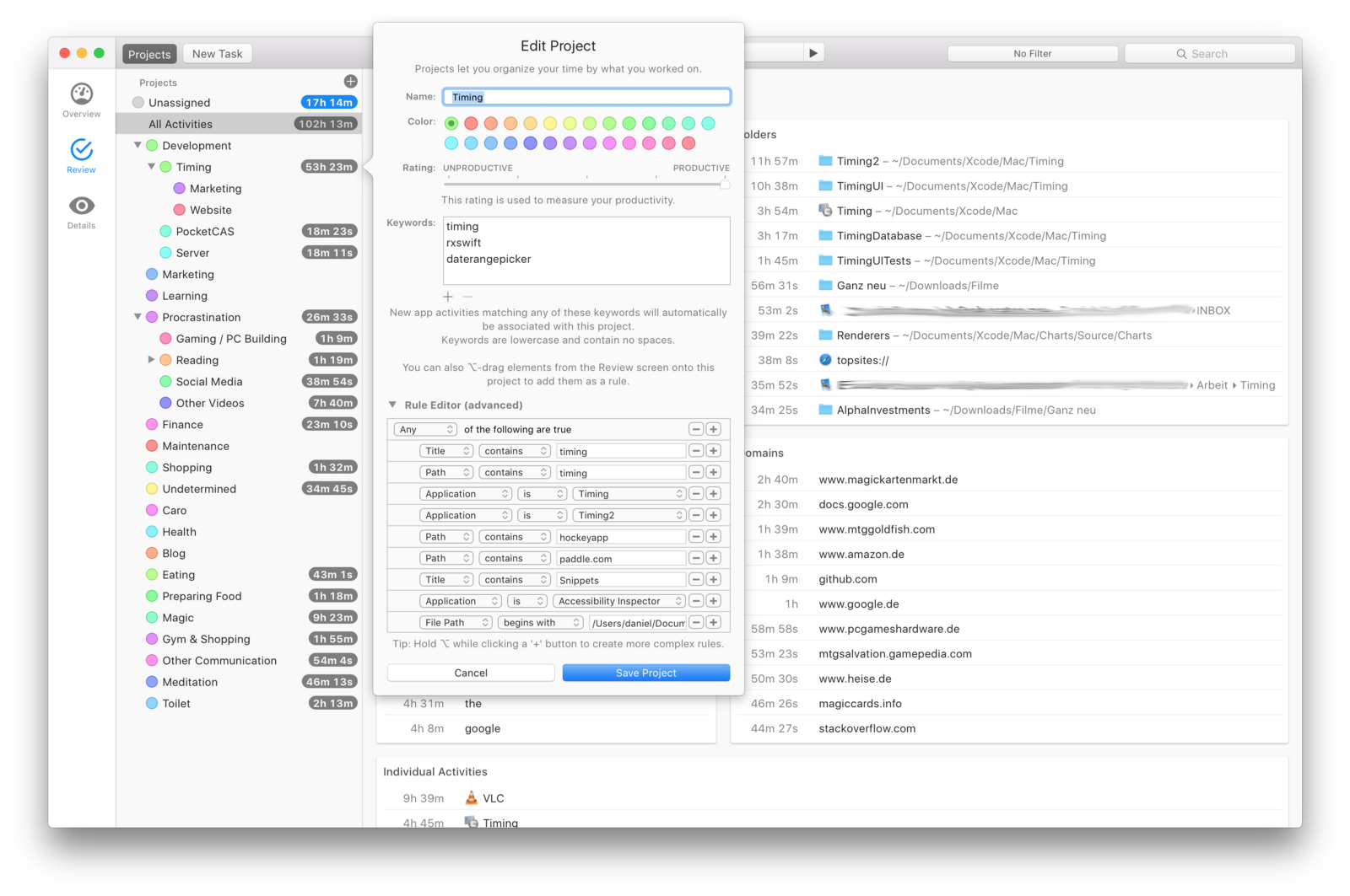 At this point, we felt confident enough to circulate Timing 2 to a wider audience — even the project editor was fairly close to the final version already. Until May, nine more betas followed (including additional features, such as manual time tracking, a reports screen, AppleScript support), but the overall design of the app changed surprisingly little from this point.
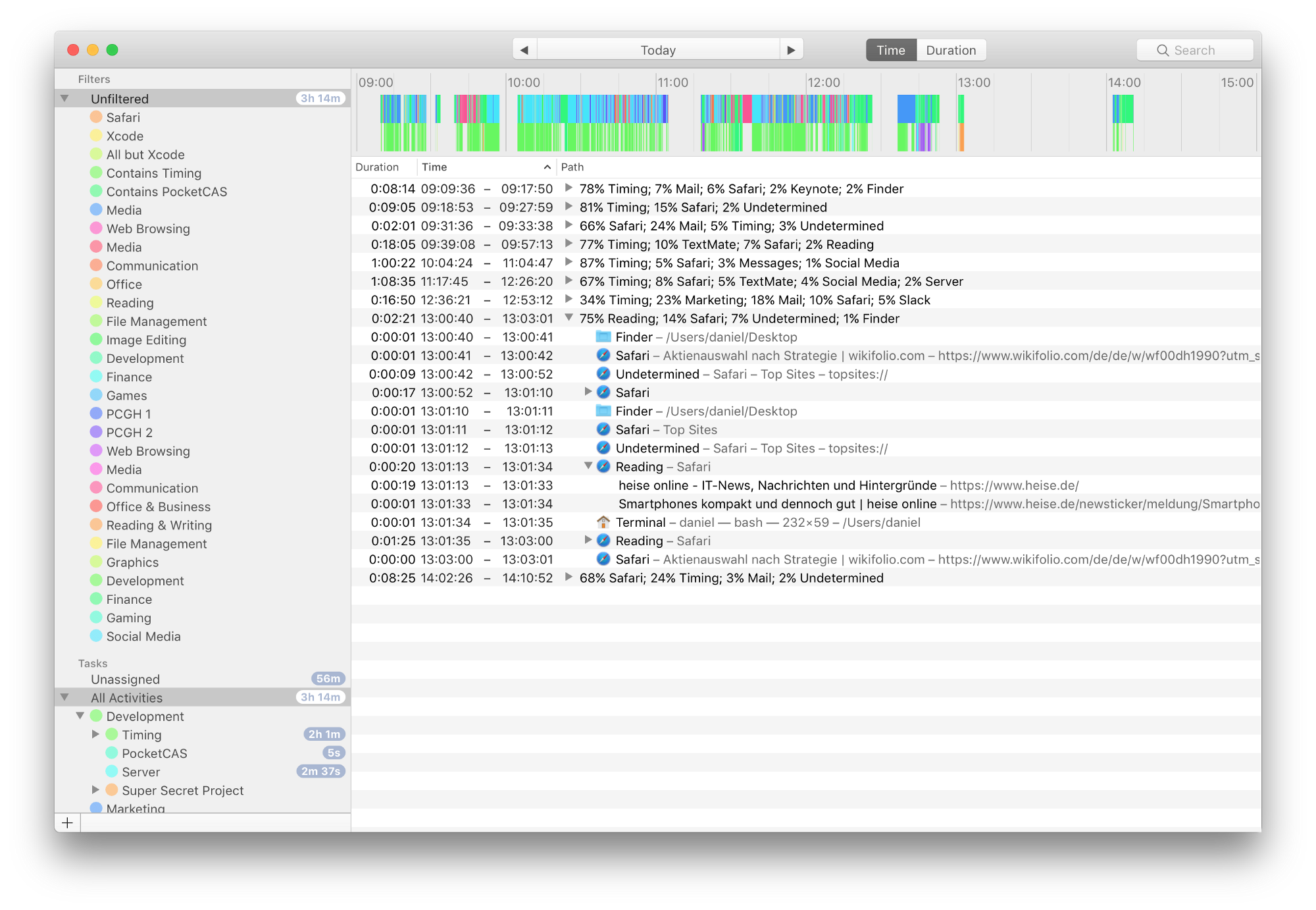
Timeline changes in detail
At first glance, the timeline hasn’t changed much over the course of the project: 
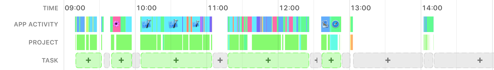 Yet what a difference these changes make!
- The task suggestions make it much easier to assign whole blocks of time at once.
- Coalescing short activities makes the timeline much less noisy and easier to comprehend. (We could probably coalesce even more aggressively.)
- The app icons on the timeline make it easier to see what a particular timeframe was about (note e.g. the block of development between 10:00 and 11:00).
- The row labels, combined with improved typography and colors, make the timeline appear much more friendly.
Conclusion
We could have stuck with our initial approaches for the activity list and automatic grouping and moved on. But the app would have been much worse for it. Luckily, we were able to step back and try different approaches that ended up working much better:
- We switched from grouping the activity list by time blocks to grouping it by four different criteria instead. This made the activity list(s) much easier to parse and lets you quickly get an overview where your time went, without having to dive in.
- The initial version of automatic grouping had you go through each block of time one by one, which was a pain to use. The modified version (task suggestions on the timeline) works much better — it lets you review all suggestions at once and pick the ones you need.
As you see, there can be quite a difference between the initial prototype of an app and the final product! Before committing to a particular approach, consider doing some user tests on your prototypes to validate whether your solution is actually solving a user problem or not. To recap:
- Your app’s design might change significantly through several iterations. Embrace that.
- Be willing to kill your darlings — some approaches might simply not work.
- A good idea itself isn’t enough. Presentation and execution make a big difference.
- Test early, test often.
- Consider building a solid technical base before polishing the interface. Having this base in place let us implement and iterate on Eduardo‘s designs quickly.
- Your first prototype will look shitty. Keep going!